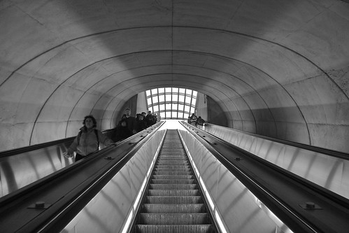
I'm pretty sure that this is Dupont Circle on the DC Metro. It has been too long since I worked in B&W, I was not sure what I was going for. The people coming down made it harder, because I would have gone higher contrast except for what it would have done to the details of their faces. I am also not sure about the symmetry. I wonder whether it might be better not to have the overall symmetry given the asymmetrical distribution of riders. Suggestions are welcome
Subscribe to:
Post Comments (Atom)


No comments:
Post a Comment